Quickstart
This page quickly aquaints you with the major features of the visual FormBuilder. It assumes that you are familiar with JGoodies Forms and it's quite analogue to the Forms' tutorial quickstart . The steps to take are:
- Find the layout
- Find the number of content rows and columns
- Build an empty layout grid with the appropriate number of rows/columns
- Add named and typed constraints to the grid
- Move/Expand constraints
- Edit rows/columns
- Customize a border and edit the presentation attributes of the constraints
- Preview (and save) the layout
- Use the layout
Note: Though only the screenshot on the introduction page is up-to-date with the current version all the text is in synch. So I recommend to have a "live" FormBuilder running while reading.
A Sample Layout
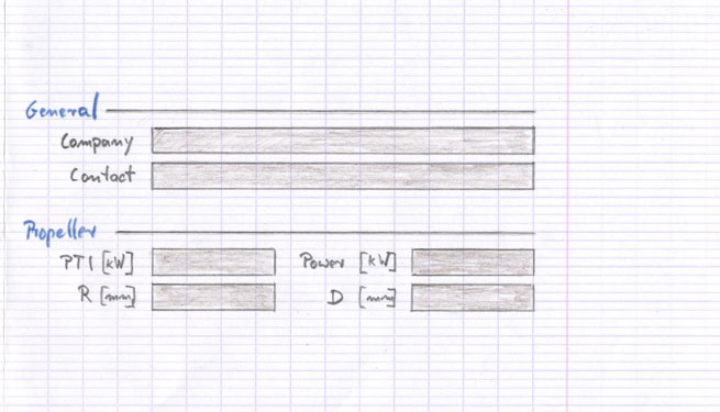
As in the original tutorial we want to implement an editor for six fields that are separated into two groups. General: company name and contact person; propeller: PTI, power, radius, diameter. We already found that we want to go with design draft D - so we are skipping step 1 for the time being.
Note: for a table of important keyboard shortcuts, see Summary
Step 2: Find the number of content rows and columns
SwingEmpire FormBuilder has a concept of content and gap lines. A content line (= row/column) is one that contains a widget. A gap is the space between content lines and is taken care of automatically if enabled..
To get the number of content rows/columns simply count the widgets that are stacked vertically/horizontally and take the max, respectively. Here we have 6 rows and 4 columns.
Step 3: Build an empty layout grid with the given number of rows/column

On the right of the screen are several tabs for setting/editing layout properties. The initial properties (that is, those that will be used at creation time) of rows/columns are settable on the tab "Defaults".
Go to the "Defaults" tab (Ctrl-F) and set the number of initial columns/rows to the number found above. Make sure the auto-insert gap button is checked. For the time being, you can leave the line types for content/gap at their defaults - they are reasonable and can be changed later easily. Open a new layout grid with Ctrl-N.
Step 4: Add named and typed constraints to the grid
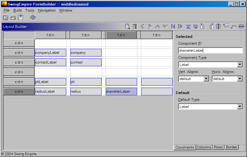
A widget is represented by a constraint that has a name, a generic type and horizontal/vertical alignment properties.
Insertion (with Ins) is done into the currently selected cell(s) or into the anchor cell if nothing is selected. The cell(s) to insert into has/have to be empty. There's always one constraint added - it can span multiple rows/columns if they are contiguous (nothing happens if they are not). The default name is null and the default type is the one selected on the component palette (currently a comboBox)
After insertion, the name can be edited directly in the table cell. As the name is used later (at runtime and in the preview) to identify and access the widget take care to give them some meaningful and reasonably unique id.
The properties of contraints can be edited in the "Constraints" tab. The changes apply to all constraints which are currently selected in the layout grid.
The keyboard shortcut to toggle the focus between the grid and the layout grid is F3. Additionally to the usual navigation keys for moving the "anchor" in the table the NumlockX keys are registered to move one cell (X = 4/6/8/2 for left/right/up/down).
One strategy for quickly building forms is to fill them in blocks of equal type - f.i. move around the grid and first insert all labels (which is the default insertion type on startup), then change the default type to TextField and insert all textfields and so on ...
Names for constraints with type Label that have a suffix "Label" are interpreted later as being labels for constraints with the same name - f.i. a Label created from the constraint "companyLabel" will have its labelFor property set to the textField named "company".
Step 5: Expand/Move constraints
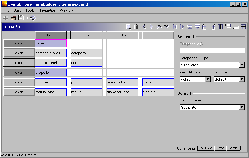
Constraints can be expanded/shrinked/moved in groups (all selected). To do so the cursor keys plus modifiers are used: Alt to move and Shift-Alt to expand/shrink.
To make the separators and the textfields in the upper block span the total grid width, select the separators and expand by repeated Shift-Alt-Right - the expansion will "catch" the two upper textfields as well.
Step 6: Edit rows/columns
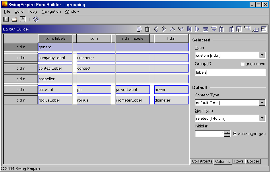
In the "Grid" tab, rows/columns can be edited and grouped. All changes apply to the currently selected rows/columns. The comboboxes for line type contains the pre-defined types. You can edit the field (every text that's a valid "encodedString" - either stand-alone or in square brackets - is accepted) to set a custom type.
To right-align the label columns, select them, go to "Grid" tab and edit the column type combo input. To group them, uncheck the radioButton "none" and type some (form-)unique group name. The changes will be reflected in the row/column headers. Customize all other rows/columns that need grouping and/or types different from the defaults used on insertion.
Step 7: Customize a border and edit the presentation attributes of the constraints
A border can be set on the "Grid" tab as well. It will be visible in the preview only because it is not considered to be part of the layout grid.
Presentation attributes are used to configure text, tooltip, mnemonic, accelerator, icon properties of the created component at runtime. To customize open the presentation builder window (Ctrl-P) and edit the appropriate cells in the attribute table.
Step 8: Preview (and save) the layout
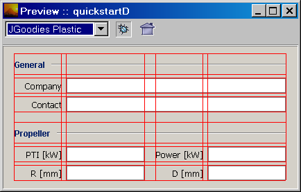
In fact this step (F5) can be done at any time during building the layout.
The preview opens up in a new frame. The preview can be shown in any of the installed L&Fs. Additionally it offers the option to show the layout grid on top of the preview content. The LayoutInfo as returned from FormLayout is dumped to the DebugInfo panel of the main frame (Note: this is incomplete - the info is only updated when the preview is updated). To return to the builder frame, press ESC or close the preview frame.
The filename will be the name of the layout - and later the name of the container created from it.
Step 9: Use the layout in code
To create a Container from a layout resource you typically pass the name of the layout to a FormLoader and let it handle the details:
                            FormLoader loader = FormFactory.getFormLoader();

                            // search somewhere relative to this class and

                            // set the presentation attributes to all comps

                            Container cont = loader.load(resourceID, getClass());
To access any child that is created from a Constraint, ask the KleoUtilities to find it:
JComponent comp = KleoUtilities.findJChildByName(cont, componentID);